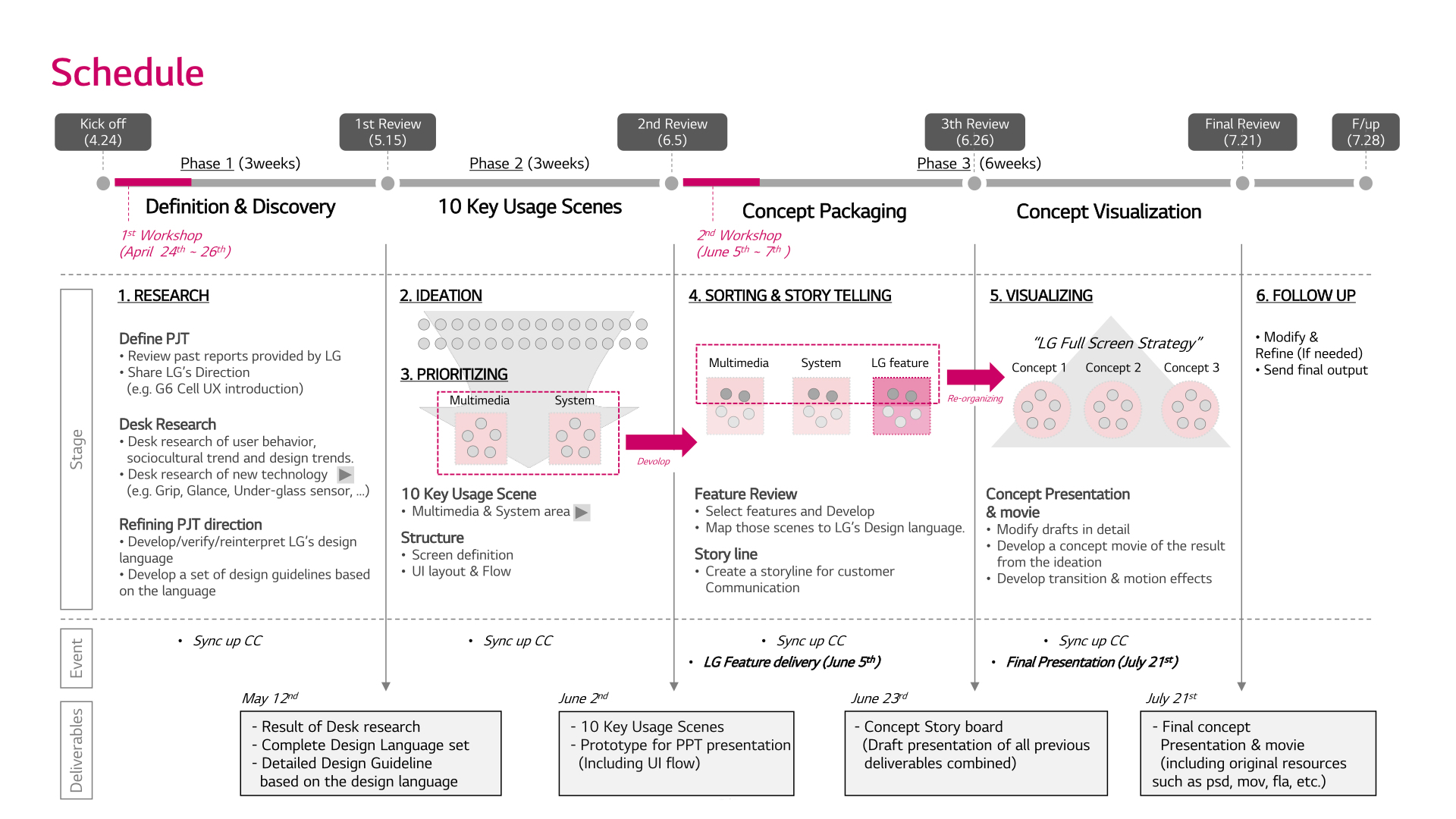
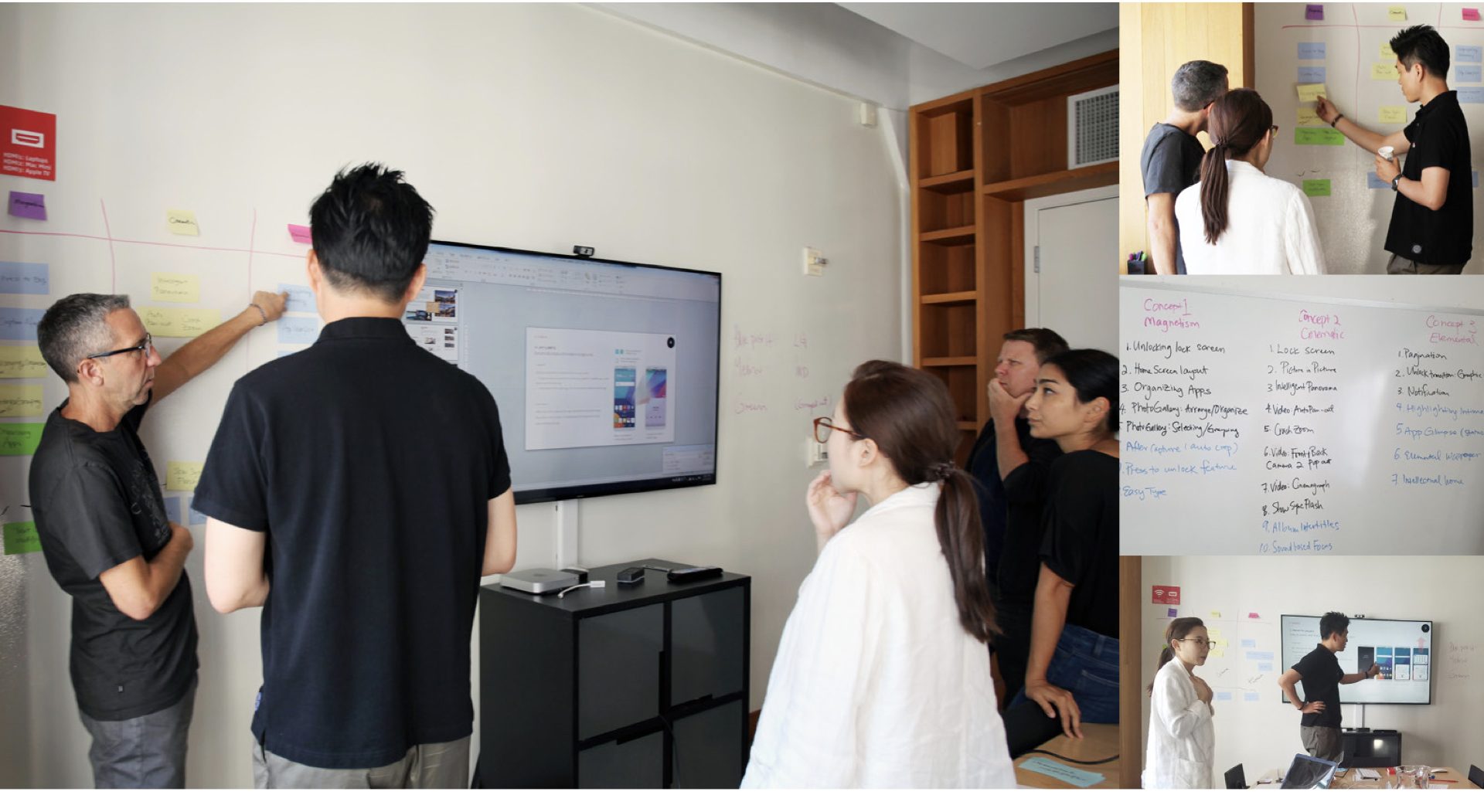
LG approached us with an interesting request: develop UX concepts and related features for an upcoming generation of smartphones. Despite the challenges presented by language and geographic barriers — not to mention LG’s idiosyncratic project flow — we succeeded in winning the approval of senior management, and several of our ideas advanced to the next round of R&D.
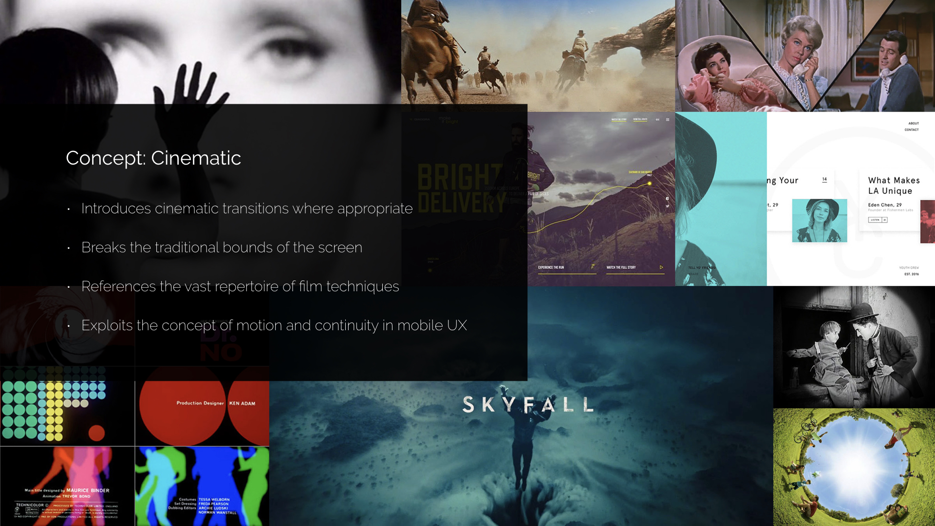
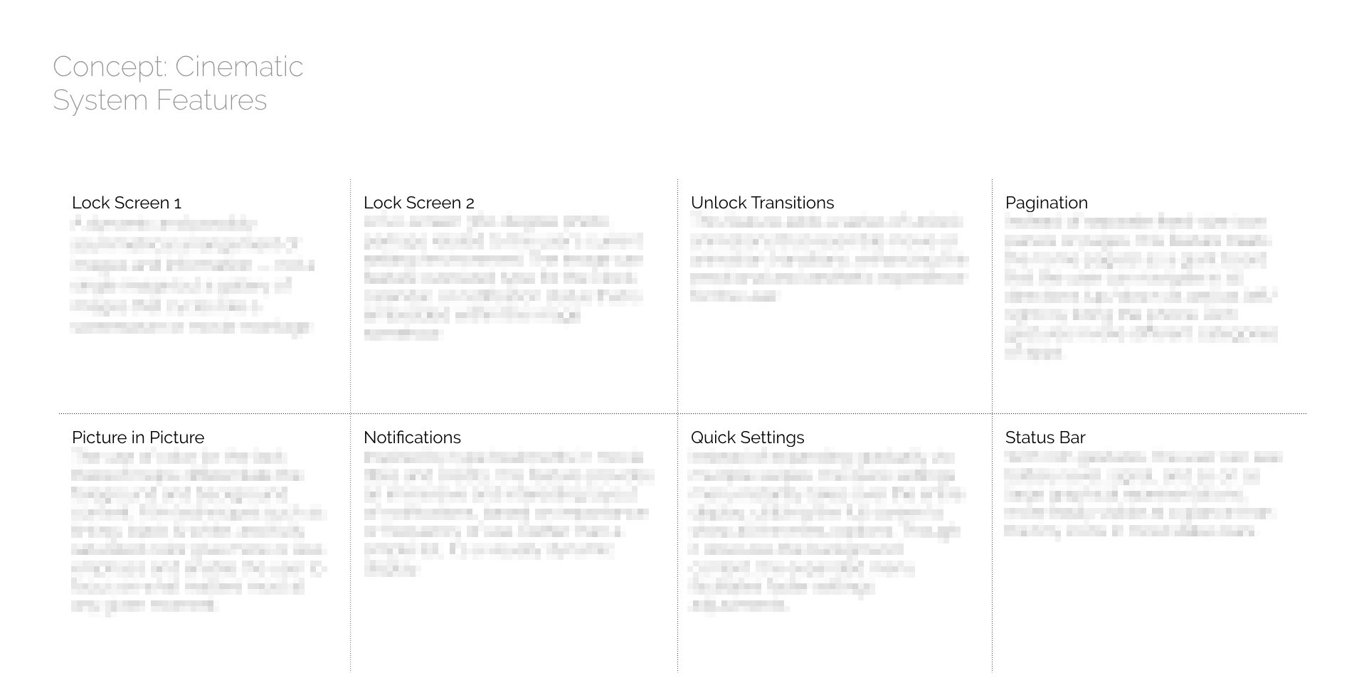
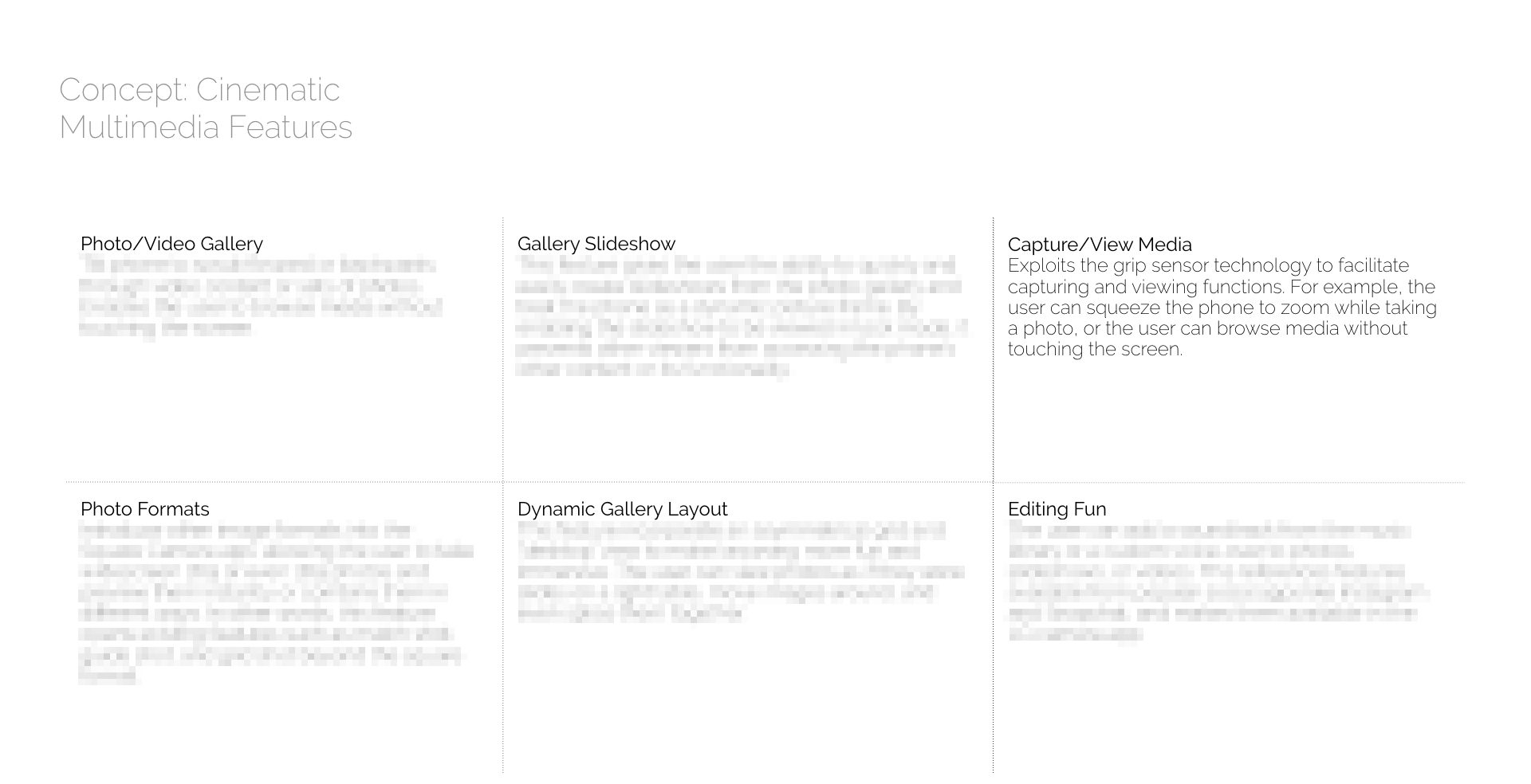
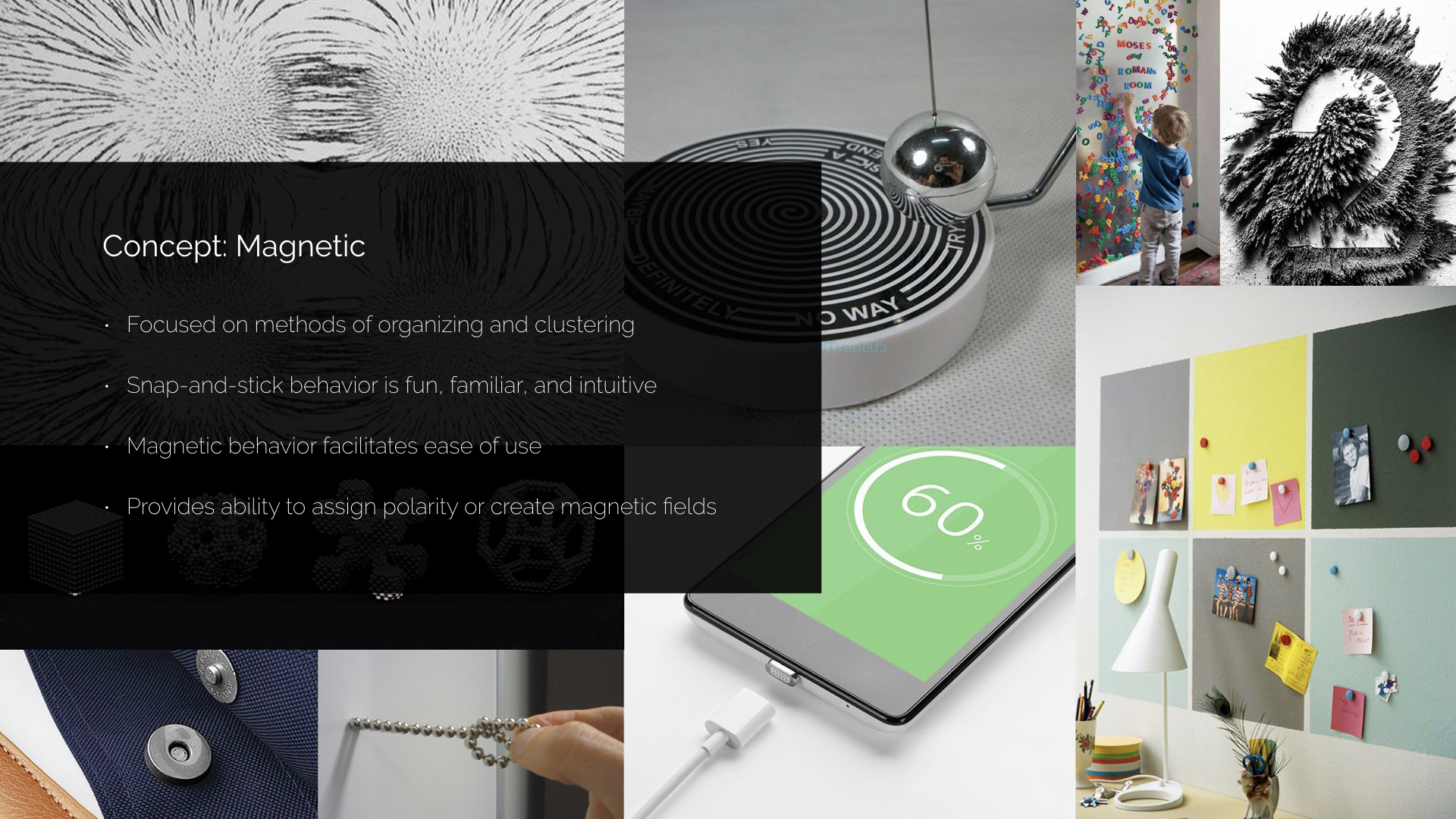
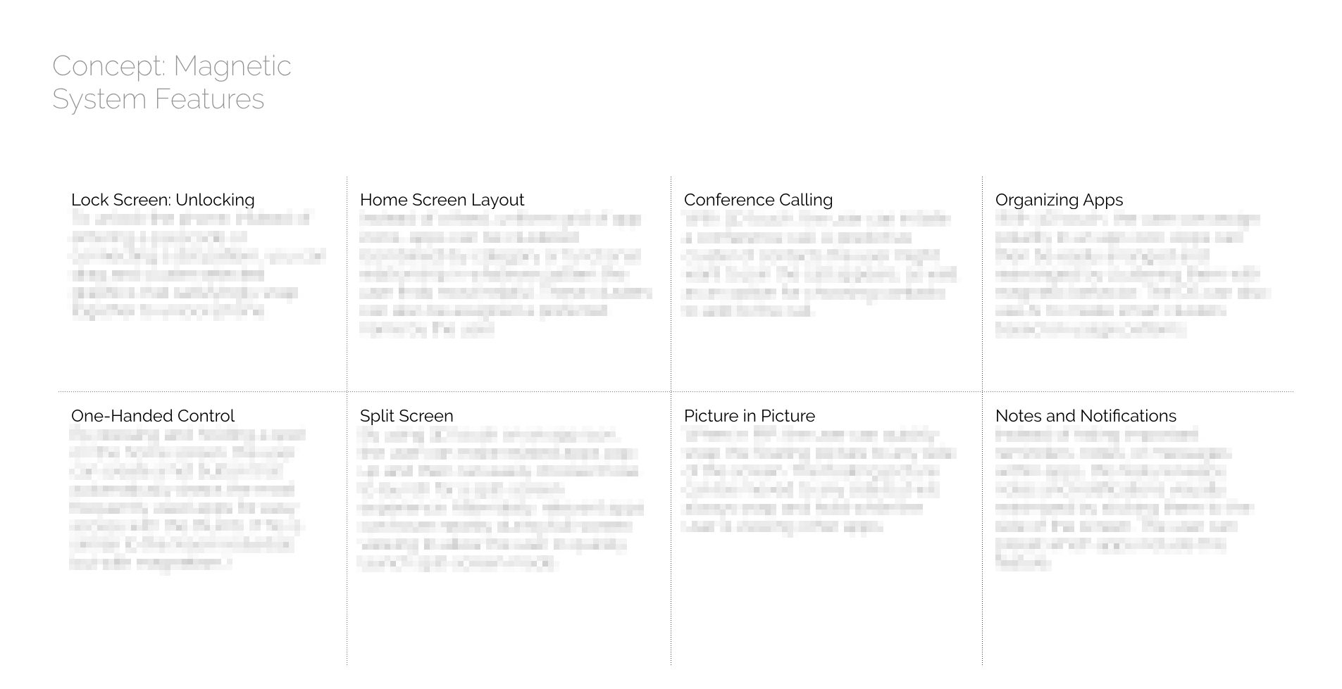
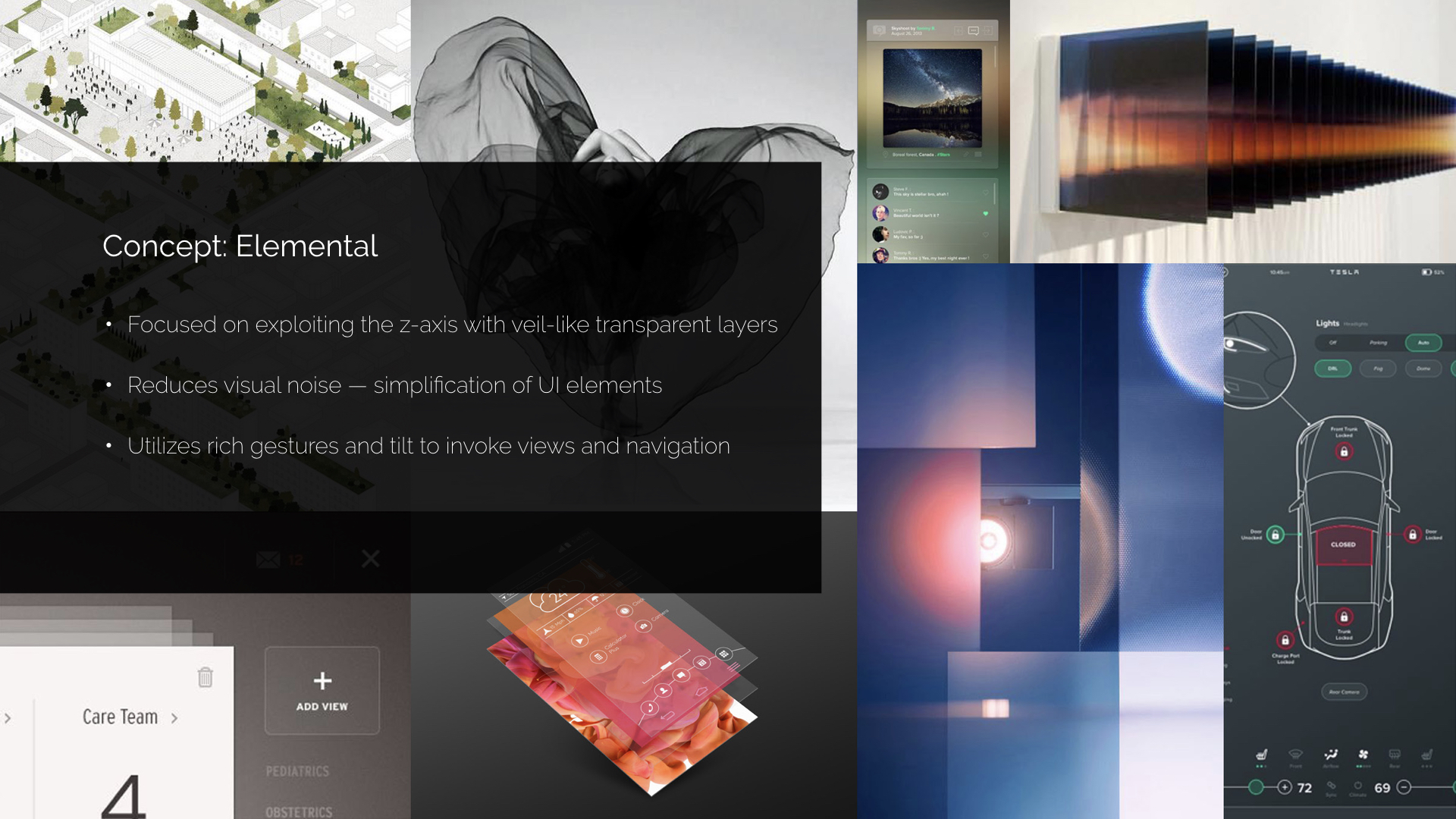
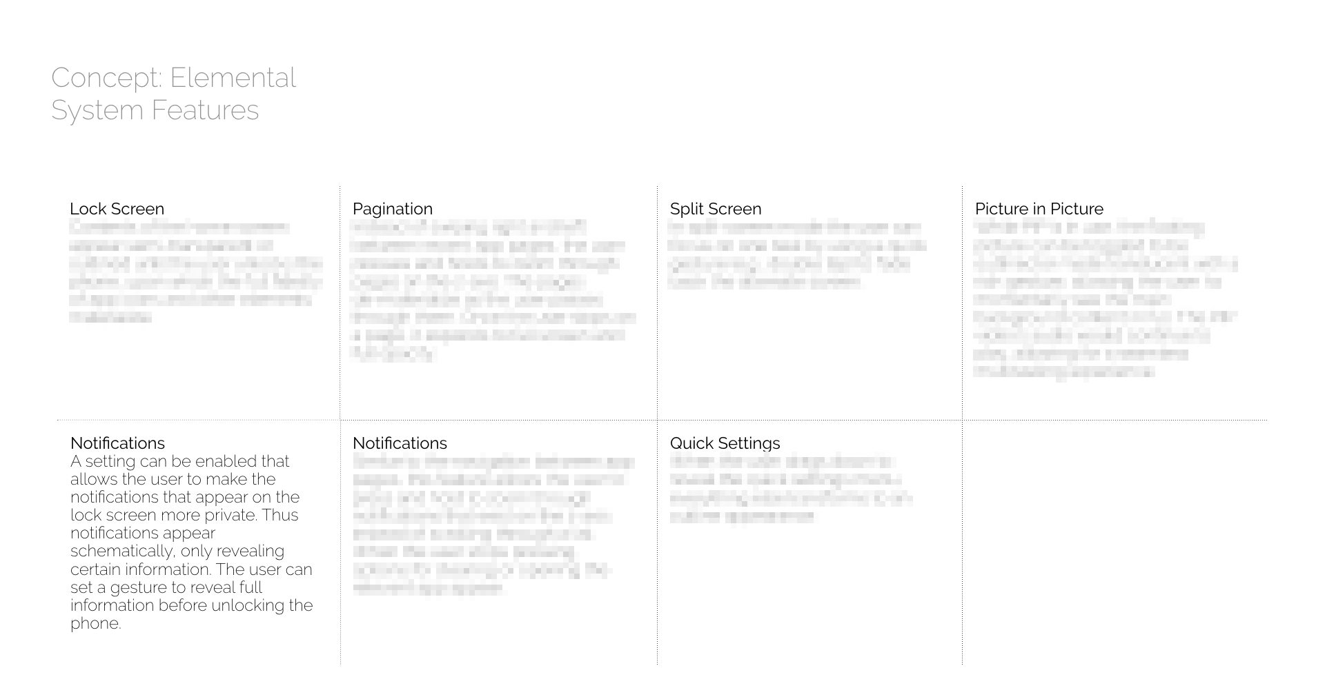
One of the chosen concepts looked to the world of cinema for inspiration; another imagined the possibilities of a UX influenced by the behavior of magnets; and a third focused on the use of layers and transparency as a way to reduce visual clutter.
Note: Details of most features have been obscured for privacy reasons.
